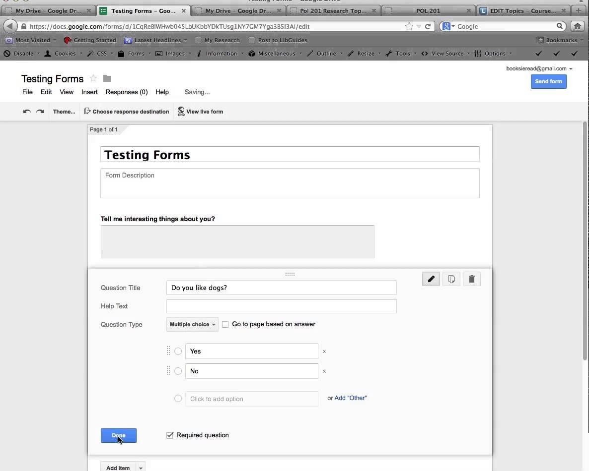
Forms play a vital role in many websites by inviting us to interact – to sign up for newsletters, submit reviews, request customer service or make a purchase – but many forms are poorly designed. With careful planning and good design, it is possible to create effective web forms that people will actually use. Your Website Maintenance Cardiff company will be able to help with any advice you need on updating your website and changing any of your web forms. It is important that you regularly review your website, including the content and any forms that you use to ensure that they are all still relevant and user friendly. Web technology advance so quickly that it is always worth checking if there is a better way of doing things.

The form as a conversation
When designing a form, it is useful to see it in terms of a conversation. Only ask for essential information rather than trying to source as much user data as possible. Avoid unclear or aggressive labelling of input fields, as these make web users nervous. A logical flow of form fields also helps gain trust and is more likely to result in a successfully completed form.
Input fields should be designed with the end user in mind. It is important to use the right kind of input field for the information being requested; for example, one common mistake is to offer a drop-down selection for a field such as ‘How did you hear about us?’ and then force the user to pick from a huge number of different options rather than simply using a text input field.
Validate, don’t humiliate
Users can often become so frustrated by form validation that they abandon it altogether. Wherever field validation is applied, error messages should be clear and to the point so that the user can be sure that whatever correction they make will be accepted.
While we all use web forms routinely, it is amazing how often forms include buttons without a clear purpose. Professionals working in web design in Newry and elsewhere have found instances of forms with a ‘submit’ button right next to a ‘clear form’ button – the potential for the end user to inadvertently delete all their input data is significant and will almost certainly result in form abandonment and lost opportunity.
By approaching form design as carefully as the design of other website elements, it is possible to have a dramatic effect on form completion rates.


